Rogers Behavioral Health
IA Redesign

Overview
In my graduate Interaction Design course, I worked in a team of three to redesign the information architecture (IA) of the Rogers Behavioral Health systems website.
Rogers Behavioral Health is one of the leading providers of mental health treatment nationally. Rogers currently provides multiple levels of behavioral health care in nine states, and continues to expand the breadth and availability of treatment.
My Role:
My primary role throughout this project was to conduct user testing, analyze data, and suggest design recommendations.
The Problem:
There are significant barriers for individuals affected by mental health disorders that make it important for behavioral health providers to present a clear and organized website. Prospective patients who access providers' sites must be able to understand how to access services and what mental health treatment entails.

Objectives
Understand the Current IA
Evaluate the structure, organization, and presentation of information related to finding and financing treatment.
Ideate Alternatives
Propose recommendations to improve site navigation and page layout for these key tasks.
Assess Our Solutions
Perform IA and usability testing to assess our recommended changes and inform future iterations
The Process
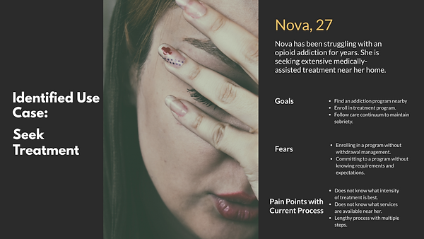
Create personas to empathize with users and focus design decisions
These personas embody the most common goals that users aim to accomplish when visiting the Rogers site:
-
Seeking treatment for a mental health concern
-
Finding options for financing treatment

Click image for a larger view.

Click image for a larger view.
Understand the current information architecture
A content inventory of over 480 discrete items on the Rogers' revealed these key insights:
Inconsistent application of navigational structure
Currently Rogers categorizes its available programs according to the following structure Diagnosis>Level of Care>Program. For several diagnoses, Rogers provided services that were not immediately visible within the main navigation.
Jargon-heavy labels
Vocabulary used throughout the first and second-level navigation requires understanding of psychological/medical terminology.
Important info was hidden within higher levels of navigation
Information related to insurance, billing, and financial assistance were located in lower levels of navigation.
Over-emphasis on text
Numerous links to program contacts were hidden within paragraphs of text and were not easily retrievable from site navigation.
Gain the users' perspective on site organization
I conducted open and hybrid card sorts with participants to understand how users might categorize different elements of the Rogers site.
Round 1: Open Card Sort
36 cards based on current labels
Results were too broad and revealed the need for simpler, more specific navigational items
Round 2: Hybrid Card Sort
16 new cards and 6 categories
There was a greater consistency in categorization patterns, but there were still outliers related to admissions info
Card sort resulted in following top-level navigational labels:
-
Contact Us
-
Explore Treatment Options
-
What to Expect
-
Finance Your Care
-
Find a Location
Assess the new navigational structure
Following the results of the card sort, I recruited participants to complete task-based testing that evaluated our proposed navigational structure. I utilized the Treejack and Chalkmark tools on Optimal Workshop.
IA Testing with Treejack
I assessed the new navigational structure by having participants complete two key tasks: (1) finding treatment and (2) locating financing options.
Finding Treatment
Participants were asked to locate transcranial magnetic stimulation (TMS) as a treatment for depression. Of the 14 participants, there was a 79% direct success rate achieved by following the desired path:
Locating Financing Options
Participants were asked to locate the financial assistance program application. Of the 14 participants, there was a 93% direct success rate achieved by following the desired path:
Explore our treatment options
finance your care
Treatment programs for adults
DEPRESSION & OTHER MOOD DISORDERS
tMS TREATMENT
financial assistance
financial assistance program
Financial assistance application
The overall high success rate for both tasks suggested that the proposed navigational structure was viable.
First-click Testing with Chalkmark
With an understanding of the overall navigational structure, I partnered with our designer to create wireframes that reflected our new task flows. I then conducted first-click testing with 9 participants to complete the same tasks of finding treatment and locating financing options.
Finding Treatment
Participants clicked through prompts that displayed the process flow of seeking information on TMS as a treatment for adult depression.
Where would you click to learn more about..
Prompt 1: ...treatment programs at Rogers Behavioral health?
Prompt 2: ...treatment options for depression?
Prompt 3: ...TMS services at Rogers?

For this task, prompts 1-3 had a total success rate of 78%. Users had the most difficulty with Prompt 2.
This heatmap shows each user’s click location for Prompt 2. Failures clicked text or the search bar.
Prompt 2 had the highest failure rate (44%) out of all tasks although participants generally understood where to find information (i.e. somewhere among the Depression and Other Mood Disorder text).

Locating Financing Options
Participants clicked through prompts that displayed the process flow of downloading the financial assistance application.
Where would you click to learn more about..
Prompt 1: ...finance options at Rogers?
Prompt 2: ...financial assistance that Rogers provides for patience?
Prompt 3: ...the Financial Assistance Program?

Key Findings
Given the high overall success rates of these tasks, I interpreted our task flows to be viable. Based on the number of clicked headings I suggested that the next iterations may benefit from making headings clickable to navigate to other related pages.
Refine the new navigational structure
After incorporating the data that I'd collected thus far, I recommended changes to the top-level navigation.
-
Clarify navigation labels to make their purposes transparent
-
Display calls to action prioritizing users motivations
-
Highlight the admissions process (Begin Your Treatment)
Recommendations for lower-level navigation items:
-
Simplify jargon-heavy labels
-
Clarify the steps to finding treatment
-
Maintain a consistent navigation choices throughout each level
-
Establish subcategories to highlight multiple steps in finding and financing treatment
initial top-level categories
What We Treat
Why Choose rogers
What to Expect
Our locations
Treatment Outcomes
final top-level categories
Explore treatment options
prepare for treatment
finance your care
find a location
Contact us
To fully establish an understanding of the new site structure, I worked with my teammates to create a site map (shown below).
Click image to magnify.

Propose directions for future research
With more time, I would conduct additional user testing with wireframes that implement the new site structure and take all research results into account. Therefore, I recommend the following directions for future research:
-
Further refinement of top-level category structure
-
Continued evaluation of more specific subcategories related to clinical information
-
Task testing of new categories and subitems
Retrospective
This project was a valuable exercise in understanding how crucial user input is in the design process. Identifying and addressing issues with a website interface proposed unique and educational challenges that have improved my UX research skills.
Key take-aways
Team collaboration and openness to new directions
This project required efficient collaboration in order to meet the timeline of a 10-week course. I had to be open to redirecting my efforts and adapting as challenges occurred.
Process-thinking vs. Interface thinking
I learned the importance of thinking beyond the existing interface. It was crucial that was faithful to the user-centered process to I propose changes that were a departure from the existing design.
Changes to my approach
Systematic recruitment of participants
In future studies, I aim to improve the generalizability of my results by implementing a more rigorous and systematic approach to recruitment. Convenience sampling, while easy, does not contribute to a diverse data set.
Modified card sort approach
I would have also started with a hybrid card sort for the first round. I found that performing an open card sort resulted in limited insights due to the highly-specific nature of the site’s content.